Official Luthiers Forum!

Owned and operated by Lance Kragenbrink
It is currently Sat Jul 19, 2025 6:11 pm


All times are UTC - 5 hours


Forum rules


Be nice, no cussin and enjoy!


Post new topic Reply to topic  [ 31 posts ]  Go to page 1, 2  Next
Author Message
 Post subject: Logo Assistance Please!
PostPosted: Mon Dec 01, 2008 8:41 pm 
Offline
Brazilian Rosewood
Brazilian Rosewood
User avatar

Joined: Thu Aug 04, 2005 7:50 am
Posts: 3152
Location: Canada
Well, I am working on my new website and decided that it is time to get a logo going. Here first is my company name and tagline that some will recognize from my packaging tape:

Attachment:
Tag.pdf


Next are 4 files that a subtly different that will (or some variation of them) become the new company Logo. So I am asking some input from all of you with a keen eye for the arts! The concept is mine and has been worked to this stage from a sketch I supplied, so you can slam away, I have tough skin (well some parts of do anyway!)

The first one:

Attachment:
HMTC4.jpg


The second one:

Attachment:
HMTC4a.jpg


The third one:

Attachment:
HMTC4b.jpg


And the fourth one:

Attachment:
HMTC4c.jpg


I am looking forward to your comments and am excited about this logo once it is done...you will see some neat things done with it!

Thanks for your help

Shane


You do not have the required permissions to view the files attached to this post.

_________________
Canada


Top
 Profile  
 
PostPosted: Mon Dec 01, 2008 8:48 pm 
Offline
Contributing Member
Contributing Member
User avatar

Joined: Thu Jan 24, 2008 8:01 am
Posts: 1399
Location: Houston, TX
First name: Chuck
Last Name: Hutchison
City: Houston
State: Texas
Country: United States
Focus: Build
Status: Amateur
Shane,
Those are very artistic. I like the third one. Just like the way the sound hole looks.

_________________
"After forty-nine years of violin building, I have decided that the search for a varnish is similar to the fox hunt. The fun is in the hunt."
Jack Batts Maker and Repairer of Fine Violins


Top
 Profile  
 
PostPosted: Mon Dec 01, 2008 9:01 pm 
Offline
Brazilian Rosewood
Brazilian Rosewood
User avatar

Joined: Tue Jan 25, 2005 6:16 am
Posts: 2692
Among that group, #3 for sure.

_________________
Howard Klepper
http://www.klepperguitars.com

When all else fails, clean the shop.


Top
 Profile  
 
PostPosted: Mon Dec 01, 2008 9:20 pm 
Offline
Brazilian Rosewood
Brazilian Rosewood
User avatar

Joined: Thu Aug 04, 2005 7:50 am
Posts: 3152
Location: Canada
Thanks for the reply's so far guys. I am hoping for many more!

Filippo, I hear what you are saying. The first couple of renditions were actually of full on dread shape embedded in the tree. I didn't like them at all! My artistic help is the son of a friend and he actually lives in Belize at the moment so our entire communication so far has been by e-mail. I really didn't like the look of the guitar in the tree as my thought about the concept is that the tree morphs into a guitar, as the process is still in progress I want just an essence of a guitar and let the imagination fill in the rest. Besides, I am really a balance rather than symmetrical type of guy. I am hoping these logos looked "balanced" and I think they do. But if they don't, I would love to hear about it.

Looking for WAY more comments!

Thanks again!

Shane

_________________
Canada


Top
 Profile  
 
PostPosted: Mon Dec 01, 2008 9:56 pm 
Offline
Contributing Member
Contributing Member
User avatar

Joined: Sat Dec 30, 2006 3:20 am
Posts: 2593
Location: Powell River BC Canada
First name: Danny
Last Name: Vincent
What is that. Some kind of trick? Spot the difference between the four. :lol:

Most definitely like the bold strings but I prefer the soundhole in #2. Great logo you've come up with. And just in time for the holiday shopping season.

What's the word on the new web site. I'm in need of some stuff pretty quick but was hoping you would have a whole bunch of cool new stuff on there that I don't need for me to buy.

I'll be in touch,
Danny


Top
 Profile  
 
PostPosted: Mon Dec 01, 2008 10:14 pm 
Offline
Contributing Member
Contributing Member
User avatar

Joined: Fri Nov 11, 2005 3:32 am
Posts: 2687
Location: Ithaca, New York, United States
I like it! I'm on the fence between #2 and #3, leaning a bit toward #3, I suppose. If it were me, I'd play more with different thicknesses of the lines - the thicker strings really makes a difference; maybe the lines of the tree don't need to be quite so thick. I might also play with the curve of the lower bout of the guitar - not to make it look more realistic, but just to see what some different curves look like. That would probably mean changing the lowest line of the tree, too. As for balance, it didn't strike me as problematic, but now that you mention it, the left/tree side is certainly heavier. Changing the weight/thickness of the lines would certainly make a difference there (for better or worse). One more thing - although I like the relative positions of the tree and the guitar the way they are, I'd be interested to see what it would look like if the guitar were moved upward. Tricky, I know, with the soundhole and strings, but maybe there's a way to do it.

Another thought: what if the tree and the guitar each had another line connecting to their respective bottom ends that extended downward a bit and suggested the roots and/or the base of the tree. It would have to be very subtly and artfully done so as not to become cliched or overstated, but it might work, and it might tie it all together in an effective way.

_________________
Todd Rose
Ithaca, NY

https://www.dreamingrosesecobnb.com/todds-art-music

https://www.facebook.com/ToddRoseGuitars/


Top
 Profile  
 
PostPosted: Mon Dec 01, 2008 11:03 pm 
Offline
Mahogany
Mahogany

Joined: Wed May 23, 2007 4:19 am
Posts: 70
Location: United States
I like the guitar part of #1, mostly. I like the soundhole, and the contrast between the delicate strings and the bold outline of the guitar. I'd like it better if the guitar outline followed the curve of the lower bout, and related to the lowest branch of the tree, a bit. Even cut short works better for me.

The tree branches are overpowering, and not as deftly represented as the guitar. Maybe they could be re-thought. The heavy semicircular terminus of the branches seems out of character with the rest of the logo, to me. It is a distraction that my eye is drawn to.

That being said, choose the one YOU like best. Anyone who thinks differently, may do so - de gustibus non disputendum est

Larry


Top
 Profile  
 
PostPosted: Mon Dec 01, 2008 11:30 pm 
Offline
Koa
Koa

Joined: Sat Apr 19, 2008 10:08 pm
Posts: 1958
Location: Missouri
First name: Patrick
Last Name: Hanna
State: Missouri
Country: USA
Shane, as a professional graphic designer, I've got to say that I think you've got too much going on in the logo. You have two basic concepts fighting for dominance here: The tree and the guitar. Having said that, though, I'll comment on what you've got. The first one won't work in some applications because the "strings" are too thin. Imagine this icon printed in very small situations--such as on a company check. You'll never see the string lines. I think the third one is the most successful. The shape of the half-rosette gives me a clear notion that I am looking at a half-form of the body here. The other rosette shapes are not this definitive. You should evaluate your icon in the context of the company name, too. You have further decisions to make about typography, alignment, letterspacing, linespacing, and a lot of other things. That's just a good, honest reaction to what you've got in this round. I am more of a minimalist. I liked some of the things you had going with the guitar icon in the previous round. Good luck with it. Patrick.


Top
 Profile  
 
PostPosted: Tue Dec 02, 2008 12:10 am 
Offline
Koa
Koa
User avatar

Joined: Wed Jun 08, 2005 1:00 pm
Posts: 1644
Location: United States
City: Duluth
State: MN
Country: USA
Focus: Build
Status: Amateur
Hi Shane!

Great concept!

If I had the opportunity to start from that concept and riff on it, I'd make all the tree strokes look like (for lack of a better phrase) Chinese brush strokes, rather than have the strokes (beneath the branches) end in circular forms. Maybe even use just one integrated zagging line to form the tree from the tip to the lowest branch, and maybe with the line thinnest at the tip and gaining in line weight as it approaches the bottom.

The first one has thin guitar string lines, and they won't work well when translated to some forms, such as embroidery, so the thicker ones will work better. I like sound hole #2 for unity with the theme.

You may not want to change the bottom of the guitar, maybe because when you saw it drawn that way, the graphic lost balance when the guitar shape stopped at the guitar butt. You could explore returning that line to form the guitar butt, then squiggle down to form the tree trunk. That would keep the "balance with asymmetry" that you like, and add a stabilizing element to the overall logo.

Well, you said, "Looking for WAY more comments!", and that was probably way more than you wanted. ;)

Dennis
{edit} I had my message half typed, and had to run away for a couple of hours. In the meantime, you've gotten some feedback that shows others are seeing some of the same thing as I am. Of course, I think Todd is brilliant! :lol:

_________________
Dennis Leahy
Duluth, MN, USA
7th Sense Multimedia


Top
 Profile  
 
PostPosted: Tue Dec 02, 2008 1:50 am 
Offline
Koa
Koa
User avatar

Joined: Thu Aug 25, 2005 4:49 pm
Posts: 1209
Location: Ukiah, CA
I'm having trouble relating the logo to your company name. I also think that the treetop is not where you get the tonewood from. So here are a couple of ideas. Maybe you could have a guitar be the base of the tree rather than the right side of it. Another idea might be to have a guitar sprouting out of a mountain. You want people to make the immediate connection from your logo to the company name. If you really like the samples you have I think you should at least simplify the image, maybe fewer branches or strings on the guitar. Above all take the time to look at it for awhile until you feel confident about it.

_________________
Ken Franklin
clumsy yet persistent
https://www.kenfranklinukulele.com


Top
 Profile  
 
PostPosted: Tue Dec 02, 2008 2:55 am 
Offline
Brazilian Rosewood
Brazilian Rosewood
User avatar

Joined: Thu Aug 04, 2005 7:50 am
Posts: 3152
Location: Canada
Again thanks for all of the comments, I am still thinking about all of this. To that end I have attached the 3rd version to the Tag and added some colours so I can get an idea how it might look all together. I like the track it is on.

Attachment:
Logo tag 1.pdf


Ken, I considered all of your suggestions as I moved towards this. I have some sketches around somewhere that I did of a mountain and a guitar and of a guitar with the neck being a tree (great minds the say!) but they didn't work that well and I decided that that was not really the vision I wanted to portray. I remember Billy T stating during one of my harvest threads, tongue in cheek I am sure, "We in the city almost forget that tops actually come from trees" or something along those lines. So the vision I want is the tree morphing into a stringed instrument, that focuses on the "tonewood" aspect of the business. I think that no mater what the graphic ends up being branding recognition will eventually lead people to associate it with the company. I too really want this to remain simple, but it really can't get too much simpler than the few lines it already is, believe me we have simplified.

Keep 'em comin'!

Thanks again

Shane


You do not have the required permissions to view the files attached to this post.

_________________
Canada


Top
 Profile  
 
PostPosted: Tue Dec 02, 2008 6:12 am 
Offline
Contributing Member
Contributing Member
User avatar

Joined: Fri Nov 11, 2005 3:32 am
Posts: 2687
Location: Ithaca, New York, United States
I clicked on your logo tag pdf this time... seeing it small makes it look more out of balance to me - the tree side too big/heavy relative to the guitar side. I also agree with Larry's comment about the heavy semicircular termini of the branches. Plus, I like that phrase "the heavy semicircular termini"... maybe a good name for a band... ;) :D

Part of me agrees with Ken's comment that there should be a mountain in the logo. But the various parts of me never get along very well. The image gives me the feeling of being at high elevation, anyway.

_________________
Todd Rose
Ithaca, NY

https://www.dreamingrosesecobnb.com/todds-art-music

https://www.facebook.com/ToddRoseGuitars/


Top
 Profile  
 
PostPosted: Tue Dec 02, 2008 7:06 am 
Offline
Mahogany
Mahogany
User avatar

Joined: Sat Feb 09, 2008 1:40 pm
Posts: 91
Location: Orangeville Ont. Canada
I vote for #3 as well.
I really like the logo Shane, but I have to say I don't care for
the way the stroke representing the butt goes off on an angle.

I don't have an alternative for you though.

Bob


Top
 Profile  
 
PostPosted: Tue Dec 02, 2008 7:10 am 
Offline
Koa
Koa
User avatar

Joined: Wed Jan 23, 2008 8:05 pm
Posts: 1567
Location: San Jose, CA
First name: Dave
Last Name: Fifield
City: San Jose
State: CA
Zip/Postal Code: 95124
Country: USA
Focus: Build
Status: Amateur
The idea of going from evergreen tree to guitar top is a fine one, but I agree with the others who have intimated that it's a bit busy. You are probably trying to say too much in what needs to be a really simple memorable and instantly recognizeable icon. Forced to choose though, I'd have to go with #3 for all the reasons previously stated by others, but, in agreement with Dennis/Bob/et al, I would like to see the lower bout curve around more.

How about playing on the word "logo" and have a "LOG-o"? Nah, that's just silly......

Cheers,
Dave F.

_________________
Cambrian Guitars

"There goes Mister Tic-Tac out the back with some bric-brac from the knick-knack rack"


Top
 Profile  
 
PostPosted: Tue Dec 02, 2008 7:53 am 
Offline
Koa
Koa
User avatar

Joined: Wed Jan 23, 2008 8:05 pm
Posts: 1567
Location: San Jose, CA
First name: Dave
Last Name: Fifield
City: San Jose
State: CA
Zip/Postal Code: 95124
Country: USA
Focus: Build
Status: Amateur
I couldn't resist having a go.....so I spent a few minutes messing around in Corel Draw and came up with this:

Image

laughing6-hehe 
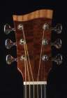
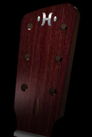
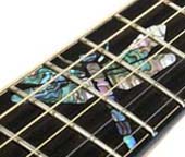
I give up!! I suck at drawing.....and logo design apparently! [uncle] gaah

It's MUCH harder than you think..... [headinwall]

Good luck Shane!!

Cheers,
Dave F.

_________________
Cambrian Guitars

"There goes Mister Tic-Tac out the back with some bric-brac from the knick-knack rack"


Top
 Profile  
 
PostPosted: Tue Dec 02, 2008 8:04 am 
Offline
Contributing Member
Contributing Member
User avatar

Joined: Fri Sep 09, 2005 7:51 am
Posts: 3786
Location: Canada
Itmay be too close for cofort .. but I think the guitars strings need to be more artistic than straight lines all the rest of the logo is swooping, non linear style, then you have the dead striaght lines ofthe strings. Check out the 12th frets logo.

maybe the silhouette of a guitar rising over the mountain tops like the sun.... you heard it here first !!!

_________________
Tony Karol
www.karol-guitars.com
"let my passion .. fulfill yours"


Top
 Profile  
 
PostPosted: Tue Dec 02, 2008 8:27 am 
Offline
Mahogany
Mahogany
User avatar

Joined: Sun Sep 07, 2008 9:56 pm
Posts: 80
Location: Texas Gulf Coast
First name: Dave
Last Name: Ellingsworth
City: Livingston
State: TX
Zip/Postal Code: 77399-1037
Country: USA
Focus: Build
Status: Amateur
I have to go along with cphanna's opinion's on this one also. My background includes graphic design also and this logo is too 'busy'. There no clear point to it. I'd recommend you print this thing out in multiple sizes, then try pasting it up on different types of collateral, say business card sized, letterhead size, etc., and see how it will work with type also - company name, address, phones, web addy, etc. You have to keep in mind how this 'recreates' on various media. Think about the color (or colors) you will use, both in the design itself and the paper it will be printed on, etc.

Don't get me wrong, I like the look, just not sure it is very representative of what you do. It looks a bit 'Christmas-like'. I'm not sure how well that plays in July in Peoria, if you get my drift.


Top
 Profile  
 
PostPosted: Tue Dec 02, 2008 8:48 am 
Offline
Cocobolo
Cocobolo

Joined: Tue May 13, 2008 9:45 am
Posts: 258
Well, I work as a graphic designer. Here's my input for what it is worth. It looks like 2 separate ideas, which it is, but I'm not feeling like they are working together. Try and tie the 2 together a bit more.

Here's a quick sketch of what I mean:
Image


Top
 Profile  
 
PostPosted: Tue Dec 02, 2008 9:05 am 
Offline
Old Growth Brazilian Rosewood
User avatar

Joined: Fri Nov 02, 2007 9:49 am
Posts: 13631
Location: Ann Arbor, Michigan
First name: Hesh
Last Name: Breakstone
City: Ann Arbor
State: Michigan
Country: United States
Status: Professional
Shane bro I wasn't going to say anything.... :D because I don't really have anything positive to say OR an alternative. But I think that you posted this because you really want honest impressions. With that said here are my thoughts:

1) The logo is indeed too busy and the sharp points of the tree branches and curves of a guitar just seem to conflict with one another.

2) The line weights are too heavy for my liking.

3) When I look at your tag line "High Mountain Tonewood Company
For the Maker of Fine Musical Instruments" I see that you have an excellent idea to not limit yourself to being branded as only a guitar tonewood provider. Good thinking. So why then have a logo that implies that you are only a guitar tonewood provider?

A possibility that comes to mind is to instead of using 1/2 a tree have a guitar or some generic representation of a stringed musical instrument rising out of "High Mountain." The mountain would add symmetry and stability with a wide base and the instrument would be symbolic of what results. The instrument could also be morphing from clouds, sun, moon, etc and no I have not been smoking the drapes..... :D

Also on the tag line instead of saying who your wares are for how about hammering home what your wares are such as saying "The Finest Tonewoods From (insert something unique about your location, elevation, etc. here)" Remember too that any text will be crawled by bots and you wanna get organic hits on your site too.


Top
 Profile  
 
PostPosted: Tue Dec 02, 2008 11:35 am 
Offline
Brazilian Rosewood
Brazilian Rosewood
User avatar

Joined: Thu Aug 04, 2005 7:50 am
Posts: 3152
Location: Canada
Thanks again for the continued input!

Dave, you don't SUCK!! And I know how hard this is for those of us that don't do it. I have been sketching my guitar making logo for about 3 years now. I am almost where I want it but I know that it could be better. It is amazing how every part of every line makes such a big difference. Although this true really for all design work!

Neil thanks for sketch. I have alerted Wylie, the graphics guy, to this thread so he can look and see what is being said here. Again, thanks everyone and if you have an opinion, please share it!

Shane

_________________
Canada


Top
 Profile  
 
PostPosted: Tue Dec 02, 2008 1:00 pm 
Offline
Brazilian Rosewood
Brazilian Rosewood
User avatar

Joined: Tue May 02, 2006 9:02 am
Posts: 2351
Location: Canada
First name: Bob
Last Name: Garrish
City: Toronto
State: Ontario
Country: Canada
Status: Professional
When I think 'High Mountain Tonewood', the image that pops into my mind is something like this (but with lightning) idunno
Attachment:
hmlogo1.jpg


If I were being more sane, I'd agree with the people that think the logo should evoke the name. ie: If it incorporated a mountain and a guitar, that would connect to your company more in my mind than strictly the tree and the guitar.


You do not have the required permissions to view the files attached to this post.

_________________
Bob Garrish
Former Canonized Purveyor of Fine CNC Luthier Services


Last edited by Bob Garrish on Tue Dec 02, 2008 1:03 pm, edited 1 time in total.

Top
 Profile  
 
PostPosted: Tue Dec 02, 2008 1:03 pm 
Offline
Brazilian Rosewood
Brazilian Rosewood
User avatar

Joined: Thu Aug 04, 2005 7:50 am
Posts: 3152
Location: Canada
KIDS!!!! gaah laughing6-hehe

_________________
Canada


Top
 Profile  
 
PostPosted: Tue Dec 02, 2008 2:15 pm 
Offline
Cocobolo
Cocobolo

Joined: Mon Jan 28, 2008 3:29 pm
Posts: 213
Location: Meredosia, IL 62665
Shane:

I tried not to read the other responses so as not to influence my reaction to your design. So, if it is repetitive, I apologize. First, I love the concept.

I don't like the brush line of the tree element. In my mind the lines should have more variety, starting thin at the top of each stroke and thickening at the bottom of each "branch". The branches should not be so consistent or bring to mind a series of cartoon noses, as it did for me on first look.

The guitar element looked fine on first impression. I would like to see the lines (strings) continue through the sound hole and I thing one string would simplify, but keep true to the concept.

It is a strong concept in that to most luthiers in conveys exactly what you do, simply and with elegance. Good luck with it and the business!

Danny R. Little


Top
 Profile  
 
PostPosted: Tue Dec 02, 2008 3:40 pm 
Offline
Koa
Koa
User avatar

Joined: Wed Jun 08, 2005 1:00 pm
Posts: 1644
Location: United States
City: Duluth
State: MN
Country: USA
Focus: Build
Status: Amateur
Neil, I love that! If you do free lance work, PM your full contact info, and I'll keep you in my "Rolodex" for business projects.

Shane, we ran into some of the same issues and had a contest at the Luthier Community to get a logo. It is impossible to make a logo that tells the story of your company, and includes all aspects. If you think about it, the top 10 most memorable logos in the history of advertising/marketing said almost nothing about the company or products/services. Where's Brock? Shouldn't you be here telling Shane he's just trying to create a memorable brand for brand awareness, not encapsulate his company in a few brush strokes. (You helped me see the concept.)

I really think a refinement of what Neil sketched would be perfect. Gotta keep it loose, free, lyrical (as Neil did - don't lose that!) If you're not planning embroidery, the sketchy feel will work on silk screened T-shirts, business card, letterhead... (hey, who uses letterhead for a tonewood business anyway!) If you want to include embroidery, then I'd solidify the lines (and maybe make the tree branch tips more pointed): "Zen" ink/paint brush strokes on rice paper.

I'l love to challenge Neil to take the final line of the lowest branch, and come down then to the left, to loosely form the left half of a trunk, and take the line at the butt of the guitar, come down and squiggle a bit to the right to form the right side of the trunk. Might not work, but I'd still like to see it.

Dennis

_________________
Dennis Leahy
Duluth, MN, USA
7th Sense Multimedia


Top
 Profile  
 
PostPosted: Tue Dec 02, 2008 4:53 pm 
Offline
Brazilian Rosewood
Brazilian Rosewood
User avatar

Joined: Thu Aug 04, 2005 7:50 am
Posts: 3152
Location: Canada
I TOTALLY agree Dennis. The logo recognition thing comes from branding, I could indeed just put a cow blowing a flute and if I marketed it with enough intensity it would then become associated with the bunch of clowns at High Mountain Tonewood Company. So as I said early onin this thread, the consept of a tree morphing into the essence of a guitar I think relates to what we are doing rather than what we are called and that sits well with me. There have been a lot of good suggestions and your idea of brush strokes is one I am going to try. I too really like Neils idea, it has some eliments that we may include as well. I have sketched tree trunks into images for a couple of years and none of them really worked, but my drawing is poor. I actually like the form of the logo so far but I can see that some line detail is required. These are really just the first draft of this concept. I remain grateful for the input and will indeed consider it all in moving to the final design.

Thanks again and keep 'em comin'! Eat Drink

Shane

_________________
Canada


Top
 Profile  
 
Display posts from previous:  Sort by  
Post new topic Reply to topic  [ 31 posts ]  Go to page 1, 2  Next

All times are UTC - 5 hours


Who is online

Users browsing this forum: No registered users and 16 guests


You cannot post new topics in this forum
You cannot reply to topics in this forum
You cannot edit your posts in this forum
You cannot delete your posts in this forum
You cannot post attachments in this forum

Jump to:  
Powered by phpBB® Forum Software © phpBB Group
phpBB customization services by 2by2host.com