Official Luthiers Forum!

Owned and operated by Lance Kragenbrink
It is currently Sat Jul 19, 2025 12:16 pm


All times are UTC - 5 hours


Forum rules


Be nice, no cussin and enjoy!


Post new topic Reply to topic  [ 29 posts ]  Go to page 1, 2  Next
Author Message
PostPosted: Tue Aug 05, 2008 9:27 am 
Offline
Contributing Member
Contributing Member

Joined: Wed Feb 02, 2005 3:14 am
Posts: 2590
Location: United States
Okay, my guy's done with round 1 of the website update...it's kind of sparse, but that's my fault for not having more material for him to work with...I (we) welcome all comments and criticism...this forum's got a lot of collective knowledge! So, have at it, and thanks!

Larry

_________________
http://www.presnallguitars.com


Top
 Profile  
 
PostPosted: Tue Aug 05, 2008 10:02 am 
Offline
Brazilian Rosewood
Brazilian Rosewood
User avatar

Joined: Tue May 02, 2006 9:02 am
Posts: 2351
Location: Canada
First name: Bob
Last Name: Garrish
City: Toronto
State: Ontario
Country: Canada
Status: Professional
Please note, this is all out of love [uncle] because I think every little bit can go a long way toward your brand image. It's also based on a two-minute browse, which is about as much (or more) as you'll get from someone going to the site before they decide to browse elsewhere or really dig in.
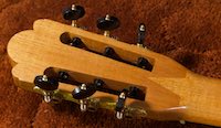
I like the content window, the content is easy to read and the guitar gallery looks nice and is very functional. The intro page should be a little more 'in your face', maybe make the headstock image more prominent or add another image to the left. One should desire the guitars based purely on the first page. The content, though, I think is pretty well done and except for a little optimization I think I'd be pretty happy with it.

The 'framework', though, is sort of off-putting from my perspective:

The top bar is very sparse and looks incomplete, the 'plain text' bar gives off a 'low budget' vibe which doesn't mesh with the instruments (ie: the instruments say 'pretty!' but the site says 'half-done'). So definitely a graphic or something semi-eye catching up top rather than the spartan text.

The menu bar at left gives me the 'no' feeling, it looks too much like those link-aggregator place-filler sites you end up at when you type in the wrong URL. It should either be smaller or prettier. Even the addition of a small graphic (like a vine or somesuch) to make it look less 'spreadsheet' would take away that 'automatically generated' look.

Overall, I think the site isn't as elegant as the content and it could leave the buyer wondering which is really indicative of the quality of your brand. A few little changes to the framework, and it'll really create that 'I must have it!' desire (like I said, the content is more or less there it's just the framework that seems slapped together)

(Don't take my site as an example, I've been so busy that the only thing I've had time to do to it since the 'skeleton' site went up was break it by accident!...check out Cornerstone's site for the 'front page desire' effect I'm talking about, and check out Lance's site and how he always has something pretty up top)

_________________
Bob Garrish
Former Canonized Purveyor of Fine CNC Luthier Services


Top
 Profile  
 
PostPosted: Tue Aug 05, 2008 10:21 am 
Offline
Old Growth Brazilian Rosewood
User avatar

Joined: Fri Nov 02, 2007 9:49 am
Posts: 13631
Location: Ann Arbor, Michigan
First name: Hesh
Last Name: Breakstone
City: Ann Arbor
State: Michigan
Country: United States
Status: Professional
Hi Larry and I love ya too bro so please take my comments as intended to be helpful.

First there is a thing that I always look for when visiting a web site and that is the impression at a glance. Your IAAG is key with a web site in that we are all very used to clicking away very quickly if nothing interests us.

The IAAG that I got from your site was a page full of text which of course requires me to read it, put some effort in with my lazy butt, before I might find something that interests me.

Instead and at least for me a striking visual that says it all in terms of what you basically offer would be my recommendation. If I am visually stimulated I am far more likely to read anyone's stinkin text.... :D

The other thing that I had is a nit but I am going to mention it anyway. Unless there is some homeland security or corporate reason why in the "Luthier" section you don't mention what you do in your day job why not mention it? A lot of folks like me look up to folks like you who keep us safe and on time. You may also find a niche of potential clients who are also in your day job industry.


Top
 Profile  
 
PostPosted: Tue Aug 05, 2008 10:31 am 
Offline
Contributing Member
Contributing Member
User avatar

Joined: Mon Jan 03, 2005 7:40 am
Posts: 2694
Location: United States
First name: John
Last Name: How
City: Auburn
State: Ca
Country: USA
I agree with most everything the others have said but, sorry Hesh, I don't see a reason that you should give info about your day job. You are presenting yourself as a luthier so no reason to cloud the issue.
But, under the heading of Luthier, the picture should be of you instead of a guitar!!

_________________
Tickle your guitar daily, and it'll tickle you back.


Top
 Profile  
 
PostPosted: Tue Aug 05, 2008 11:10 am 
Offline
Brazilian Rosewood
Brazilian Rosewood
User avatar

Joined: Sun Dec 25, 2005 7:58 pm
Posts: 2946
Location: United States
PICTURES.... LARRY! BIG...FREAK'IN PICTURES!!!! We want pictures!! We want pictures!!

The obvious point in web design is the web is a visual medium. Most people who sell on the internet don't seem to get the idea of that! I like your site it is a little spartan, like you said, you gotta get this guy some pix! As wonderful of a guy as you are, :D debonair, brave, well humored, easily approached, flying giant airplanes through the sky, but

.... most people don't give a Flirk'in Schmidt! :D

They are there to see the guitars or process or learn or laugh at something.

You build a great guitar and that needs to be shown! Most people I work with are more interested in doing what they do, and they should be, but a web page is like a business card that allows one to show everything that one does in a carefully controlled fashion and that should be taken advantage.

I see nothing wrong with the site generally but get that guy some PIX! Look at Brocks site... Lances... Cumpiano... Somogyi.... You name it... there's NICE PIX!

And nice presentation too! :mrgreen:

I can see, no problemo, at all, with showing a few pix of you flying around, that could do nothing but help because it shows competence, accuracy, precision which is obviously reinforced in your work, but the purpose of the site is to show off guitars!

IT'S ABOUT THE GUITARS MAN !!! laughing6-hehe

(Don't get too put off by what some consider my... over emphatic nature!)

_________________
Billy Dean Thomas
Covina, CA

"Multi famam, conscientiam, pauci verentur."
(Many fear their reputation, few their conscience)


Last edited by Billy T on Tue Aug 05, 2008 11:21 am, edited 1 time in total.

Top
 Profile  
 
PostPosted: Tue Aug 05, 2008 11:12 am 
Offline
Brazilian Rosewood
Brazilian Rosewood
User avatar

Joined: Sun Dec 25, 2005 7:58 pm
Posts: 2946
Location: United States
You need some blow up's too those teeny pix in your gallery don't cut it! :D

_________________
Billy Dean Thomas
Covina, CA

"Multi famam, conscientiam, pauci verentur."
(Many fear their reputation, few their conscience)


Top
 Profile  
 
PostPosted: Tue Aug 05, 2008 11:39 am 
Offline
Koa
Koa
User avatar

Joined: Wed Oct 10, 2007 2:47 am
Posts: 781
Location: Wauwatosa, WI, USA
With a quick viewing, the one thing I don't like are the pop up windows. its a good start though.


Top
 Profile  
 
PostPosted: Tue Aug 05, 2008 11:39 am 
Offline
Contributing Member
Contributing Member

Joined: Wed Feb 02, 2005 3:14 am
Posts: 2590
Location: United States
Great guys! Keep 'em coming! I gave my designer the link to this thread, so let him have it! [:Y:] Billy, you did click on the gallery pix right? They do get bigger in a new window!

_________________
http://www.presnallguitars.com


Top
 Profile  
 
PostPosted: Tue Aug 05, 2008 11:49 am 
Offline
Old Growth Brazilian Rosewood
User avatar

Joined: Fri Nov 02, 2007 9:49 am
Posts: 13631
Location: Ann Arbor, Michigan
First name: Hesh
Last Name: Breakstone
City: Ann Arbor
State: Michigan
Country: United States
Status: Professional
Man I wish that Billy would be specific and let us know how he really feels....... :D


Top
 Profile  
 
PostPosted: Tue Aug 05, 2008 12:00 pm 
Offline
Koa
Koa
User avatar

Joined: Tue Oct 17, 2006 3:52 am
Posts: 1287
City: Lawrence
State: Kansas
Zip/Postal Code: 66047
Status: Amateur
Hey Larry, Looks good to me. I don't like the green but that’s just me. I really like the map, I've never seen that before and I think it’s great [:Y:]
During my career at my "real" job I helped build the 2 VC-25As that are used as Air Force One. Some of my clients are pilots and get a kick out of the fact that they own a guitar built by a guy that helped build Air Force One. With that in mind you might want to mention your "real job", might help with some sales. In the gallery section it would be nice to click on a guitar and see more pics. I really need to have someone update my web page :oops:

_________________
Say what you do, Do what you say.


Top
 Profile  
 
PostPosted: Tue Aug 05, 2008 12:38 pm 
Offline
Contributing Member
Contributing Member
User avatar

Joined: Sat May 17, 2008 1:11 pm
Posts: 2390
Location: Spokane, Washington
First name: Pat
Last Name: Foster
Country: USA
Focus: Build
Yeah, c'mon, Billy, speak yer mind!

Seriously, though, Larry, I like a lot of your site, but the main page does need a hook. Good structure, the site map is good. Along with the other suggestions, like pictures, I personally prefer the simplest gallery pages. It seems like yours require a lot of mouse clicks if I want to look at all the pictures. It's a hook, so make it as easy as possible to use. The viewer is a gadget/feature that's fun for the builder (DAMHIKT) to put into a site, but I don't know that it adds to the viewer's experience.


There's a starkness, perhaps an unfinished look that I think Bob alluded to. I think that could be somewhat alleviated by not using the entire width of the window. Perhaps variable margins, so there's space between the page and the sides of the window. That might cozy it up a bit. Look at some slick, new magazines and see how they use empty space. Also, I think a lot of the visuals in a guitar have to do with the look of wood, you know, the deep, rich colors of well-finished wood. I'd play that up more in your color scheme, and with more contrast in your photos. The green, though nice and soft, doesn't convey that at all, and doesn't connect with the colors in the woods. The header is very plain to my eye too, and it's the same on every page. I think it needs a nicer font (anything that sort of matches your logo might be a start) and a more dynamic image, perhaps something different on every page. It's a good start, and I think a lot of the changes we've suggested would not be very difficult to make, assuming your web person is using a modern web page building app.

You asked for hounds, and it seems they're loose! Hope this helps. Good luck with it. We'll be looking in on it.

Pat

_________________
formerly known around here as burbank
_________________

http://www.patfosterguitars.com


Top
 Profile  
 
PostPosted: Tue Aug 05, 2008 12:55 pm 
Offline
Contributing Member
Contributing Member

Joined: Wed Feb 02, 2005 3:14 am
Posts: 2590
Location: United States
Yes, HOUNDS! wow7-eyes Bring it! This is what I'm after! (My website guy may be broken down emotionally, but hey, he asked for it too! :) )...thanks guys for all the advice, criticism, comments, etc.

_________________
http://www.presnallguitars.com


Top
 Profile  
 
PostPosted: Tue Aug 05, 2008 1:24 pm 
Offline
Contributing Member
Contributing Member
User avatar

Joined: Wed Feb 15, 2006 7:37 am
Posts: 4819
Hey Larry

It's a bit circa 1999 to me. I would find one theme informationally and work from there. Then try to bring the design up to date.

http://haveamint.com/

This site works well as a model. It's one product and everything on the site is predicated on featuring it in it's different pieces. I feel like your site at this point is trying to talk about too many things. I'd focus it more. Talk about your guitars. Offer media that features your guitars if possible. Block quotes about what people like about your guitars if possible. Maybe offer a shop tour towards the bottom. Contact info at the bottom. That kind of thing.


Top
 Profile  
 
PostPosted: Tue Aug 05, 2008 6:15 pm 
Offline
Koa
Koa
User avatar

Joined: Fri Feb 22, 2008 8:26 am
Posts: 1041
Location: sweden
First name: Lars
Last Name: Stahl
City: Stockholm
Country: Sweden
Focus: Build
Status: Amateur
Hi Larry. Well as a webdesigner I would say this. I would not use "the whole page" as this is out of date in my eyes. also try to keep the text to a minimum as most people dont like to read much on webpages. the Index should be like an good ad for a car or whatever, get the buyer to feel like wow, I want that guitar. the first impression they get on the page often reflects on the rest they see on the page fancy index fancy guitars. may not be the case all the time but a buyer often thinks like this, at least I try to think so :-). check out http://www.doerrguitars.com/home.html although he to uses a bit to much text on the Index.

I fixt your Index page a bit in dreamweaver just to see how It would look centered and how "I would have done it" with the material available on the index.
It is supposed to be centered allthough, its an "image" of the page I made, so it may come up a bit to the left, and smaller or larger than if done proper.see below. Press to make larger.

Attachment:
Larry P homep..png


Sincerely Lars


You do not have the required permissions to view the files attached to this post.


Top
 Profile  
 
PostPosted: Wed Aug 06, 2008 4:23 am 
Offline
Brazilian Rosewood
Brazilian Rosewood
User avatar

Joined: Sun Dec 25, 2005 7:58 pm
Posts: 2946
Location: United States
L. Presnall wrote:
Billy, you did click on the gallery pix right? They do get bigger in a new window!
No Lar! I'm retarded! If my computer doesn't give me the finger, when I mouse_over, I'm lost! laughing6-hehe laughing6-hehe laughing6-hehe
Now you tell me! duh

Hesh wrote:
Man I wish that Billy would be specific and let us know how he really feels....... :D
Pat Foster wrote:
Yeah, c'mon, Billy, speak yer mind!
You... don't .... want..... to.....know! wow7-eyes
Be grateful for what you got !! Trust me on this!
laughing6-hehe laughing6-hehe laughing6-hehe

I hope your Webmaster isn't too banged up over this! It sounds more brutal than it is! What I always do is find some body's site and rip them off! :D Actually, I use that as inspiration! It seems to help get ideas.

_________________
Billy Dean Thomas
Covina, CA

"Multi famam, conscientiam, pauci verentur."
(Many fear their reputation, few their conscience)


Top
 Profile  
 
PostPosted: Wed Aug 06, 2008 6:12 am 
Offline
Brazilian Rosewood
Brazilian Rosewood
User avatar

Joined: Sun Dec 25, 2005 7:58 pm
Posts: 2946
Location: United States
Lar, If I could give a little suggestion about your pix in your gallery, your web master saved your photos as .gif's, this is not the best choice for the gradient shadows in the photos. It leaves the shadows looking rough, and it's way too big for what it does. .Gif's are used for hard line oriented graphics and do a great job used that way.

Another thing, in clipping the guitar the shadow was left as part of the photo so as to match the green BG. It would of probably of been better to either leave the white BG or add a CG shadow, if your guy has the expertise.

I did a quick job to one of your pix to give an idea of what I'm talking about.

Here's the photo copied from your site and one I've worked over

Image Image

I did some color correction because it looked washed out and added a shadow after clipping out the old and saved it as a .jpg. If I had the original photo it would probably come out much better and it already is less than half the size of yours. If I spent more time on it I could probably get it to look better but this is just to give you an idea. If your guy has some questions just have him email me.

Hope this helps!

_________________
Billy Dean Thomas
Covina, CA

"Multi famam, conscientiam, pauci verentur."
(Many fear their reputation, few their conscience)


Top
 Profile  
 
 Post subject: Thoughts
PostPosted: Wed Aug 06, 2008 8:24 am 
Offline
Koa
Koa

Joined: Mon Jan 10, 2005 8:18 am
Posts: 825
Location: Florida, United States
First name: Craig
Last Name: Lavin
City: Sunrise
State: Fl
Zip/Postal Code: 33323
Country: USA
Focus: Build
Status: Professional
Hi Larry- as someone going through the exact same process with designers right now I can say this- the page you have is completely boorish and technical. It might as well be a page for AT&T or some other utilitarian venture. I honestly only browsed it for one minute, but you know- that's all that I was drawn in for. This site has been "seen" before by everyone, it's a standard layout.
No one is going to sit and learn about your instruments unless they are drawn in first. The site is about guitars but you can't see much about the guitars. The photos and imagery are like all the other "regular" guitar sites out there. The guitars won't stand out as unique on the internet unless the web page is.

My first set of designers are wonderful people, and they tried their hardest to give me a product I would love, but the fact is they were from the corporate world and designed me a corporate website. I had to let them go. Your clients are individuals- most likely men in their mid-life crisis days (35 and over), with some disposable income, trying to escape the corporate world via guitars.
This site design brings them right back to the day job they are trying to get away from.

Your designer needs to understand the product, and the clients more. Few web designers have the vision to see they are building an advertisement and marketing space more then they are building an "information site". It's seemingly a very common issue.

It's easy to sugar coat the critiques, but you said letter rip, so I guess since I am in the same boat as you I want to give you a sincere judgment. Sorry if it seems harsh. I can also be completely off base and wrong, but if I was looking for a musical companion to invest in, an extension of myself that sings for me and sounds the way I want it to, expresses my soul and emotions clearly to the world and is also beautiful and is a potential part of me, do these guitars do that? Does the site do that? They should be one in the same. Site = product. Of course the info and other things have to be built in, but there are ways of doing that.


Hope this helps. Don't kill me... :D
Craig L

_________________
www.handcraftinlay.com


Top
 Profile  
 
PostPosted: Wed Aug 06, 2008 10:41 pm 
Offline
Contributing Member
Contributing Member

Joined: Wed Feb 02, 2005 3:14 am
Posts: 2590
Location: United States
Thanks for all the advice and comments guys! Let me reiterate...this is what I asked for and you all gave it to me straight! I can take it if my website fella can! [:Y:] He's watching this thread and we'll do round 2 with the site from what we glean here!

_________________
http://www.presnallguitars.com


Top
 Profile  
 
PostPosted: Thu Aug 07, 2008 2:15 am 
Offline
Brazilian Rosewood
Brazilian Rosewood
User avatar

Joined: Sun Dec 25, 2005 7:58 pm
Posts: 2946
Location: United States
L. Presnall wrote:
I can take it if my website fella can! [:Y:] He's watching this thread and we'll do round 2 with the site from what we glean here!


Great!!
With what your paying us in consultation fees I hope you get it right this time! :D laughing6-hehe laughing6-hehe laughing6-hehe Image

Looking forward to it Lar!

_________________
Billy Dean Thomas
Covina, CA

"Multi famam, conscientiam, pauci verentur."
(Many fear their reputation, few their conscience)


Top
 Profile  
 
PostPosted: Thu Aug 07, 2008 3:55 am 
Offline
Koa
Koa
User avatar

Joined: Fri Feb 22, 2008 8:26 am
Posts: 1041
Location: sweden
First name: Lars
Last Name: Stahl
City: Stockholm
Country: Sweden
Focus: Build
Status: Amateur
One important thing is,also like Billy said. dont make the photos is gif format. use PNG or Jpeg. or similar. they will be larger. BUT they will look great and most are on fast connections so it will be no problems.
here are 2 photos from Kevin ryans site. to show you how it shoulod look. these are both in Jpeg format. and 44k and 56k large "small". and still looking this good.
Attachment:
Bevel Flutes & Rosette.JPG
Attachment:
ryan.JPG


You do not have the required permissions to view the files attached to this post.


Top
 Profile  
 
PostPosted: Thu Aug 07, 2008 1:52 pm 
Offline
Brazilian Rosewood
Brazilian Rosewood
User avatar

Joined: Sun Dec 25, 2005 7:58 pm
Posts: 2946
Location: United States
Yup! Ryans pix are awesome!
I wonder if he does them himself?

Lar, this is along the lines I want to see! I've taken some comedic license with the text, but you get the idea'r!

Get some top quality pix, some mavigation, and a real signature so people can write bad checks and open credit card applications with your account and your there, Man! :D

Attachment:
prelim.jpg


You do not have the required permissions to view the files attached to this post.

_________________
Billy Dean Thomas
Covina, CA

"Multi famam, conscientiam, pauci verentur."
(Many fear their reputation, few their conscience)


Top
 Profile  
 
PostPosted: Thu Aug 07, 2008 2:55 pm 
Offline
Brazilian Rosewood
Brazilian Rosewood
User avatar

Joined: Tue May 02, 2006 9:02 am
Posts: 2351
Location: Canada
First name: Bob
Last Name: Garrish
City: Toronto
State: Ontario
Country: Canada
Status: Professional
skinnysteel wrote:
One important thing is,also like Billy said. dont make the photos is gif format. use PNG or Jpeg. or similar. they will be larger. BUT they will look great and most are on fast connections so it will be no problems.
here are 2 photos from Kevin ryans site. to show you how it shoulod look. these are both in Jpeg format. and 44k and 56k large "small". and still looking this good.


Kevin has a Canon 5D, though, so he's got a bit of a leg up in photos on...well...probably every other luthier on Earth. That camera is *drool* awesome.

_________________
Bob Garrish
Former Canonized Purveyor of Fine CNC Luthier Services


Top
 Profile  
 
PostPosted: Thu Aug 07, 2008 4:05 pm 
Offline
Contributing Member
Contributing Member
User avatar

Joined: Wed Feb 15, 2006 7:37 am
Posts: 4819
Bob Garrish wrote:
Kevin has a Canon 5D, though, so he's got a bit of a leg up in photos on...well...probably every other luthier on Earth. That camera is *drool* awesome.


I don't know, man. I sold my 20D to start saving for a Phase One back. Should have it in 20 years :D


Top
 Profile  
 
PostPosted: Thu Aug 07, 2008 4:08 pm 
Offline
Contributing Member
Contributing Member
User avatar

Joined: Wed Feb 15, 2006 7:37 am
Posts: 4819
I'm not crazy about the design, but Billy's mockup has the type of focus I was referring to earlier.

For what it's worth (your developer won't like this), Noah Stokes is a professional designer. This is what he does and his work is current. He's also recently completed a guitar.

www.noahstokes.com


Top
 Profile  
 
PostPosted: Thu Aug 07, 2008 4:57 pm 
Offline
Koa
Koa
User avatar

Joined: Fri Feb 22, 2008 8:26 am
Posts: 1041
Location: sweden
First name: Lars
Last Name: Stahl
City: Stockholm
Country: Sweden
Focus: Build
Status: Amateur
No disrespect, Bob, I do not think it has to do with what camera you use ! there are Cameras out there today, like the Canon EOS 400D and the even older 350D that would make like at least 99% as good photos, only the photographers would tell the difference. "in my humble opinion" and these cameras are like 300-500USD. Although what is important is how you take the photos, background, "Photoshop" etc.

Billy personally did like the page you made a lot ! and I also think your right by saying use "top quality pix"

James, I bet its a money question to !! ?? I bet Noah charges at least 130-150 per houer. ? Not sure about Webdesigners in the US. but here its quite expensive.

Stick with the designer youve got. Just get him to listen to pro designers like us and your set hahahaha :lol: :lol: :lol: wow7-eyes

Lars


Top
 Profile  
 
Display posts from previous:  Sort by  
Post new topic Reply to topic  [ 29 posts ]  Go to page 1, 2  Next

All times are UTC - 5 hours


Who is online

Users browsing this forum: J De Rocher and 26 guests


You cannot post new topics in this forum
You cannot reply to topics in this forum
You cannot edit your posts in this forum
You cannot delete your posts in this forum
You cannot post attachments in this forum

Jump to:  
Powered by phpBB® Forum Software © phpBB Group
phpBB customization services by 2by2host.com