Official Luthiers Forum! http://www.luthiersforum.com/forum/ |
|
Custom Headstock Lettering: Project Notes http://www.luthiersforum.com/forum/viewtopic.php?f=10101&t=38076 |
Page 1 of 2 |
Author: | Randy Jones [ Thu Oct 25, 2012 10:13 pm ] |
Post subject: | Custom Headstock Lettering: Project Notes |
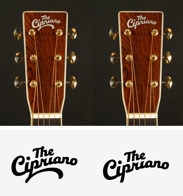
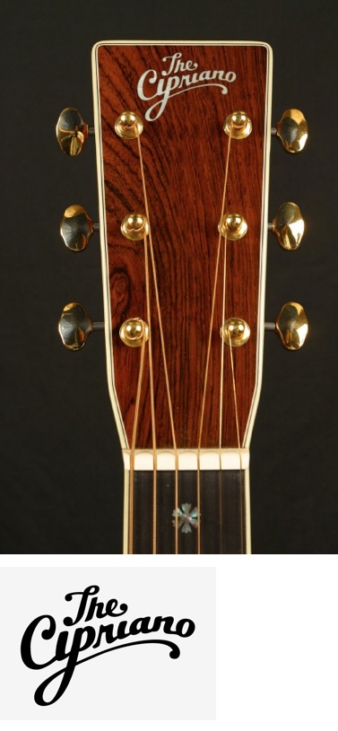
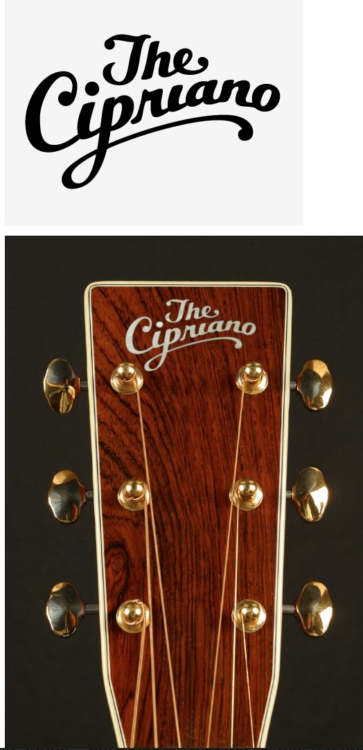
Had an opportunity to draw some letters for Roberto Cipriano. I'm grateful for his trust and excited about the results so I thought I'd share them with you. Roberto was looking for a fairly traditionally styled version of his last name. The context would be a squared headstock like a Martin or Collings. I started by sketching out half a dozen different ideas very quickly to establish a direction. ![]() 
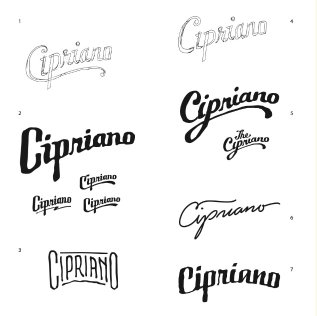
I didn't look at anything for reference, but had the following models in mind: 1. My own design 2. Gibson-esque 3. Guild-esque 4. My own design 5. The Gibson-esque (The Flatiron, The Kentucky etc) 6. Lowden-esque 7. My own design |
Author: | Randy Jones [ Thu Oct 25, 2012 10:21 pm ] |
Post subject: | Re: Custom Headstock Lettering: Project Notes |
Roberto liked 2, 3 and 5 but we settled on 5 as the way forward. With the next revision I would take the design digital, refine it, clean it up and optimize for inlay. ![]() I photoshopped a headstock to help visualize. When reversed the feeling of a logo can be much different. |
Author: | Randy Jones [ Thu Oct 25, 2012 11:32 pm ] |
Post subject: | Re: Custom Headstock Lettering: Project Notes |
Roberto noticed I strayed too far from the original concept and wanted something closer to a cleaned up version of sketch #5 I'd made. He aslo decided to go with a decal instead of inlay, changing the constraints a bit. ![]() |
Author: | Randy Jones [ Thu Oct 25, 2012 11:39 pm ] |
Post subject: | Re: Custom Headstock Lettering: Project Notes |
Last think we noticed is the "ip" combination started to look like a "y" when it's dot was being defined by the ball terminal on the T. So after some final adjustments and general polish, this is the final design: ![]() It was fantastic to collaborate with Roberto (it doesn't hurt that he has a classy looking last name)! Very much looking forward to seeing non-photoshopped results in the forums one of these days. |
Author: | nyazzip [ Fri Oct 26, 2012 12:00 am ] |
Post subject: | Re: Custom Headstock Lettering: Project Notes |
well, i for one am not seeing any graphics/photos. anyone else....? |
Author: | CharlieT [ Fri Oct 26, 2012 12:17 am ] |
Post subject: | Re: Custom Headstock Lettering: Project Notes |
Nope |
Author: | Randy Jones [ Fri Oct 26, 2012 12:18 am ] |
Post subject: | Re: Custom Headstock Lettering: Project Notes |
Ugh. Obviously I can see them. Let me host the images elsewhere and see what happens. Did that fix it? |
Author: | nyazzip [ Fri Oct 26, 2012 12:40 am ] |
Post subject: | Re: Custom Headstock Lettering: Project Notes |
10-4, issue fixed |
Author: | meddlingfool [ Fri Oct 26, 2012 2:20 am ] |
Post subject: | Re: Custom Headstock Lettering: Project Notes |
Fixed one problem and caused another... Originally, the first I was dotted by the above T. Moving over "the" has caused the second i in cipriano to be dotless....doesn't look right to me. if you're concerned about the 'y' appearance, cut the line between the i and the p... The post you showed with the single headstock was brilliant, just sever the p from the i as the r is severed from the p.... my thoughts... |
Author: | ChuckB [ Fri Oct 26, 2012 5:31 am ] |
Post subject: | Re: Custom Headstock Lettering: Project Notes |
If you are looking for comments, I would eliminate the "The". Chuck |
Author: | enricopg [ Fri Oct 26, 2012 10:15 am ] |
Post subject: | Re: Custom Headstock Lettering: Project Notes |
Also the underscored p makes it look a lot like Cyrano (de bergerac) |
Author: | Don Williams [ Fri Oct 26, 2012 10:41 am ] |
Post subject: | Re: Custom Headstock Lettering: Project Notes |
I'm still picking up the unwanted "y" strongly, and the missing dot over the second i is very noticeable. Overall, it's nice though. |
Author: | Fred Tellier [ Fri Oct 26, 2012 12:14 pm ] |
Post subject: | Re: Custom Headstock Lettering: Project Notes |
Loose the "THE" and to me it is too large, but the script looks great. Fred |
Author: | blindrobert [ Fri Oct 26, 2012 5:34 pm ] |
Post subject: | Re: Custom Headstock Lettering: Project Notes |
As the new owner of this graphic, I like the "The". This was fun to work on and Randy is really insightful and was great about listening to my comments and concerns. If you need some work, I think you'd find him a pleasure to work with. |
Author: | Barry Daniels [ Sat Oct 27, 2012 9:43 am ] |
Post subject: | Re: Custom Headstock Lettering: Project Notes |
Paid endorsement? |
Author: | Tony_in_NYC [ Sat Oct 27, 2012 10:14 am ] |
Post subject: | Custom Headstock Lettering: Project Notes |
blindrobert wrote: As the new owner of this graphic, I like the "The". This was fun to work on and Randy is really insightful and was great about listening to my comments and concerns. If you need some work, I think you'd find him a pleasure to work with. How can you even see it? Posted from the future using Tapatalk |
Author: | Randy Jones [ Sat Oct 27, 2012 12:24 pm ] |
Post subject: | Re: Custom Headstock Lettering: Project Notes |
Hey guys thanks for your comments! Ultimately I'm judging success based on Roberto's feedback, but yours is appreciated and has spurred further discussion between us which will improve the results. All good things! To a couple specific comments: Roberto paid me for the work. His recommendation is unsolicited. Tony. Are you saying you still can't see the images, or are you saying you can't see the "the" ![]() I love drawing letters and look forward to sharing more here as it relates to guitars! |
Author: | Bryan Bear [ Sat Oct 27, 2012 2:41 pm ] |
Post subject: | Re: Custom Headstock Lettering: Project Notes |
I'm not Tony, but I think he is more concerned about Blindrobert's ability to see them. . . |
Author: | nyazzip [ Sat Oct 27, 2012 3:09 pm ] |
Post subject: | Re: Custom Headstock Lettering: Project Notes |
looks too much like a baseball team logo with that underline, for my tastes...in other words, common looking/not very unique. the "guildesque" is pretty cool IMO |
Author: | Pat Hawley [ Sat Oct 27, 2012 4:00 pm ] |
Post subject: | Re: Custom Headstock Lettering: Project Notes |
Roberto, obviously this is your decision, but, for what it's worth, I'm the the camp that is advising that you ditch the "The". Pat |
Author: | Randy Jones [ Sat Oct 27, 2012 4:34 pm ] |
Post subject: | Re: Custom Headstock Lettering: Project Notes |
My Tony-o-Meter appears to be faulty. Ha! |
Author: | John Mayes [ Sat Oct 27, 2012 5:46 pm ] |
Post subject: | Re: Custom Headstock Lettering: Project Notes |
I would take out the "the" as well. Otherwise looks elegant |
Author: | blindrobert [ Sat Oct 27, 2012 6:09 pm ] |
Post subject: | Re: Custom Headstock Lettering: Project Notes |
It's fun reading all the feedback, but the "The" is staying. I like it and I like that it has a quotidian un-fanciness to it. I will scale it down compared to the rendering, I like smallish logos. The Guild-esque might get developed and used for my architecture/construction business cards. No paid endorsement and I wasn't so much as asked to comment, let alone reimbursed somehow for my feedback. I did it under my own steam because I liked the process and the results. Jeepers, some of you guys must have pretty low opinions of humanity if you immediately question the integrity of someone's praise over less than $200 worth of work! ![]() Oh - I'm only blind in one eye, the good eye is 20/10. |
Author: | Clinchriver [ Sat Oct 27, 2012 7:03 pm ] |
Post subject: | Re: Custom Headstock Lettering: Project Notes |
I like it. |
Author: | Tony_in_NYC [ Sat Oct 27, 2012 7:28 pm ] |
Post subject: | Custom Headstock Lettering: Project Notes |
I was indeed referencing blindrobert's name when questioning his ability to see it. Although at the time, I thought it was just a blues inspired username and not an actual reflection on Robert's vision. No offense meant. Ever. I'm just a knucklehead who like to joke around. Posted from the future using Tapatalk |
Page 1 of 2 | All times are UTC - 5 hours |
Powered by phpBB® Forum Software © phpBB Group http://www.phpbb.com/ |